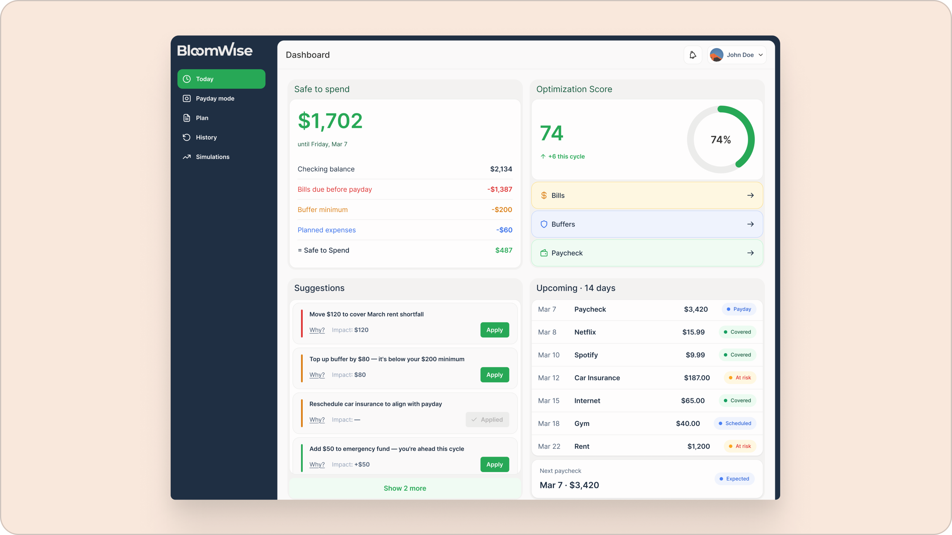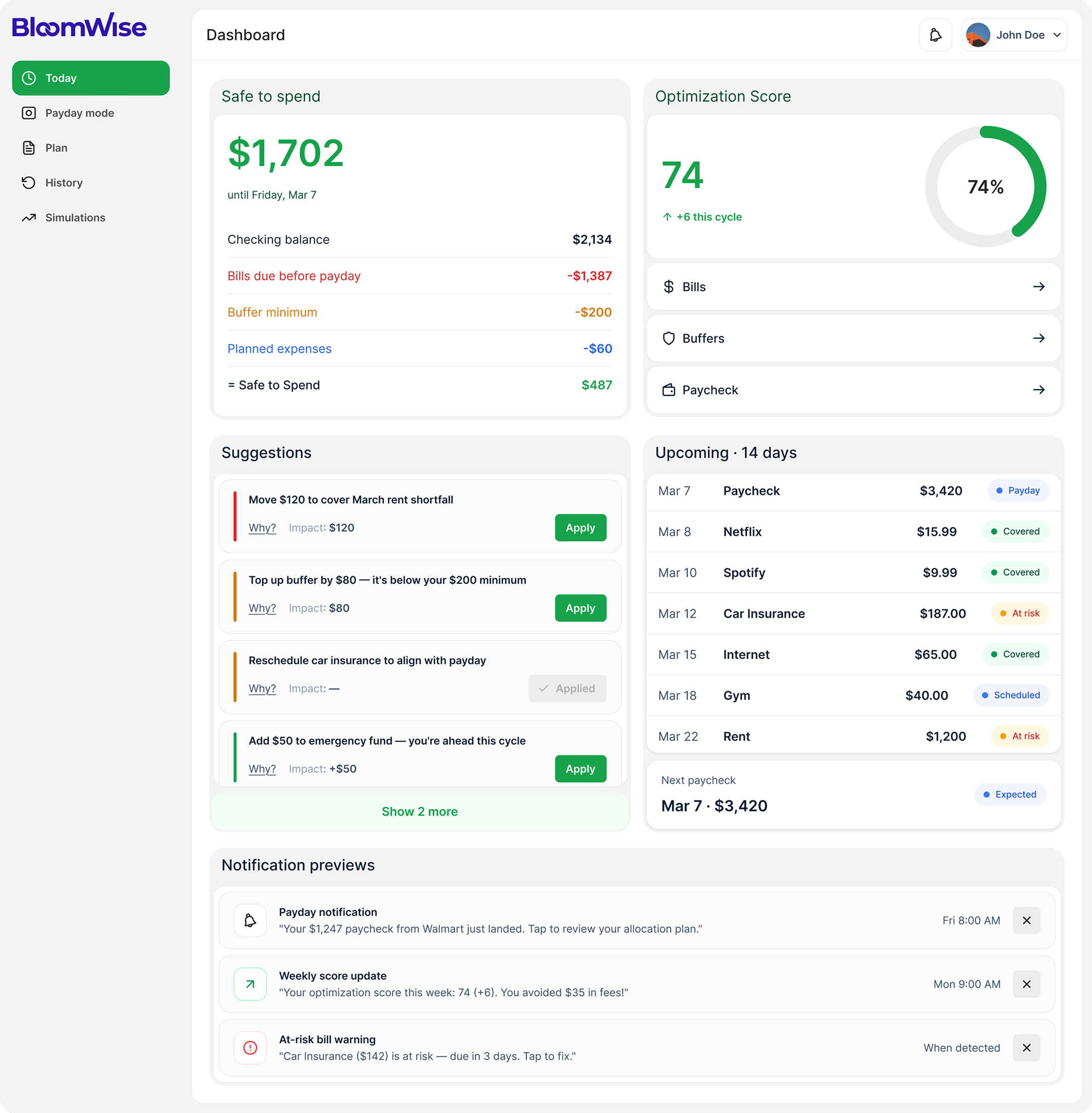
Product analytics tools tend to fail in one of two ways: they drown you in raw events with no narrative, or they lock the answers behind a query builder only the data team can operate. Either way, the people who need to decide something can't.
Insfers turns a 2.4M-events-a-day firehose into decisions non-technical teams can act on today. We led product and UI/UX design — from the data model to a pixel-perfect, dev-ready dashboard that answers before it shows a single chart.
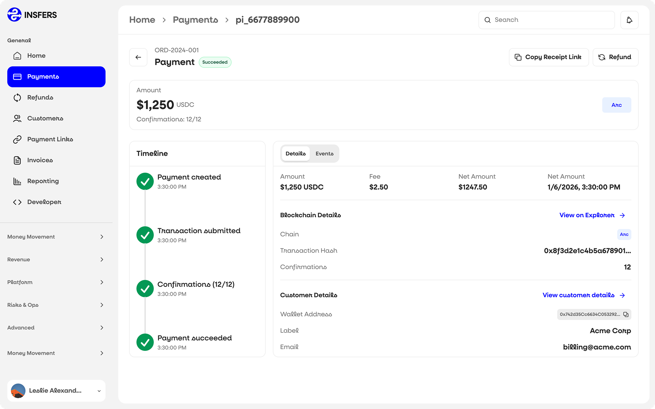
The home view surfaces what changed and what to do about it, in language anyone can read. Anomalies and shifts are explained, not just plotted. When someone wants the detail, the full raw dataset is always a click away — drill on demand, never by default.
Built to scale, the system keeps 2.4M daily events feeling calm. Adoption spread well beyond the data team to product, growth, and leadership — the people the tool was really for.
We started from the questions teams actually ask — what changed, why does it matter, what should we do next — and designed the dashboard to answer them before showing a single visualization. The interface leads with a plain-language read on what's happening, with the raw data always one click beneath.
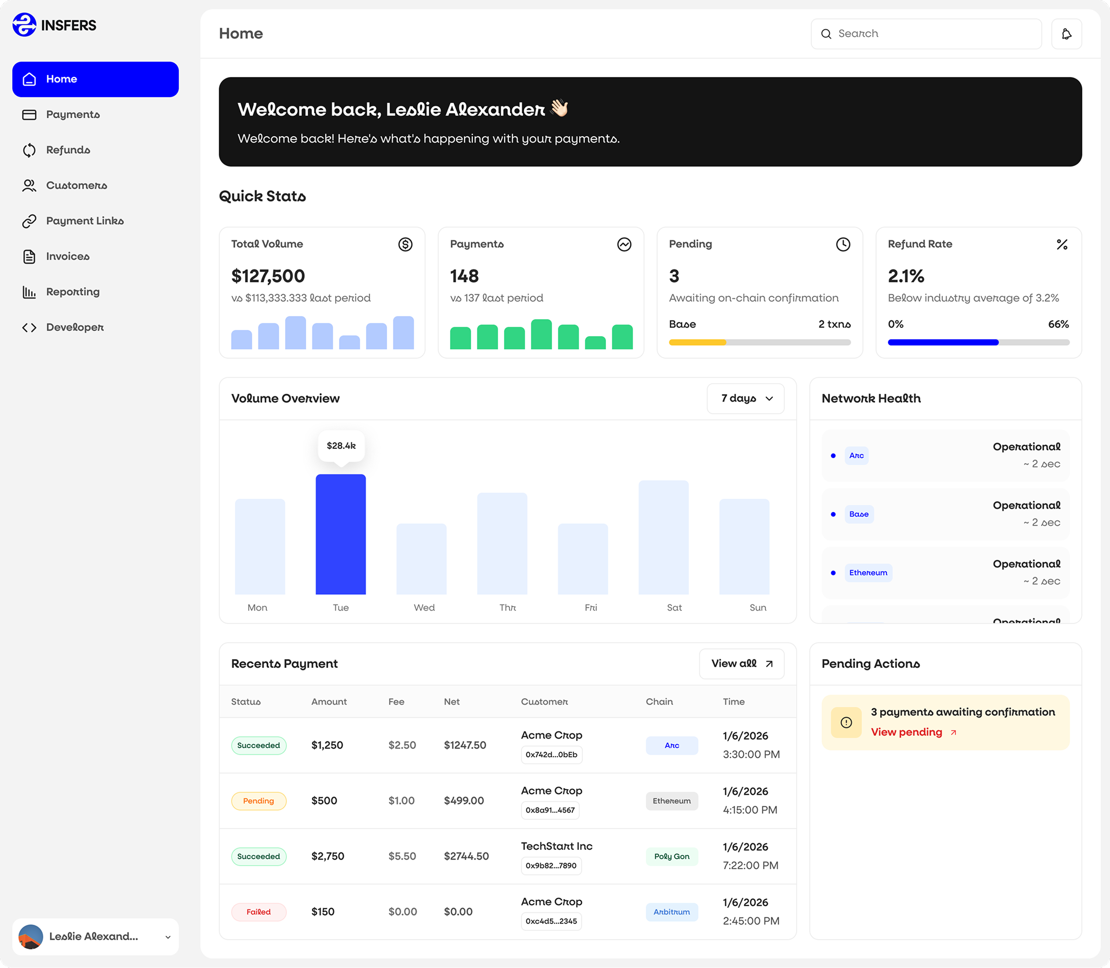
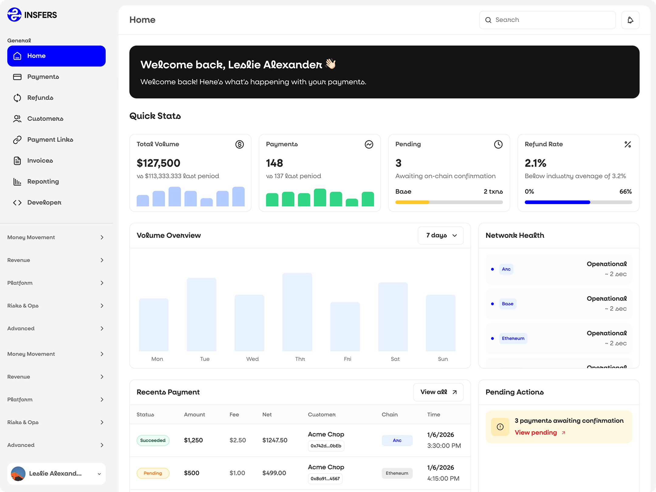
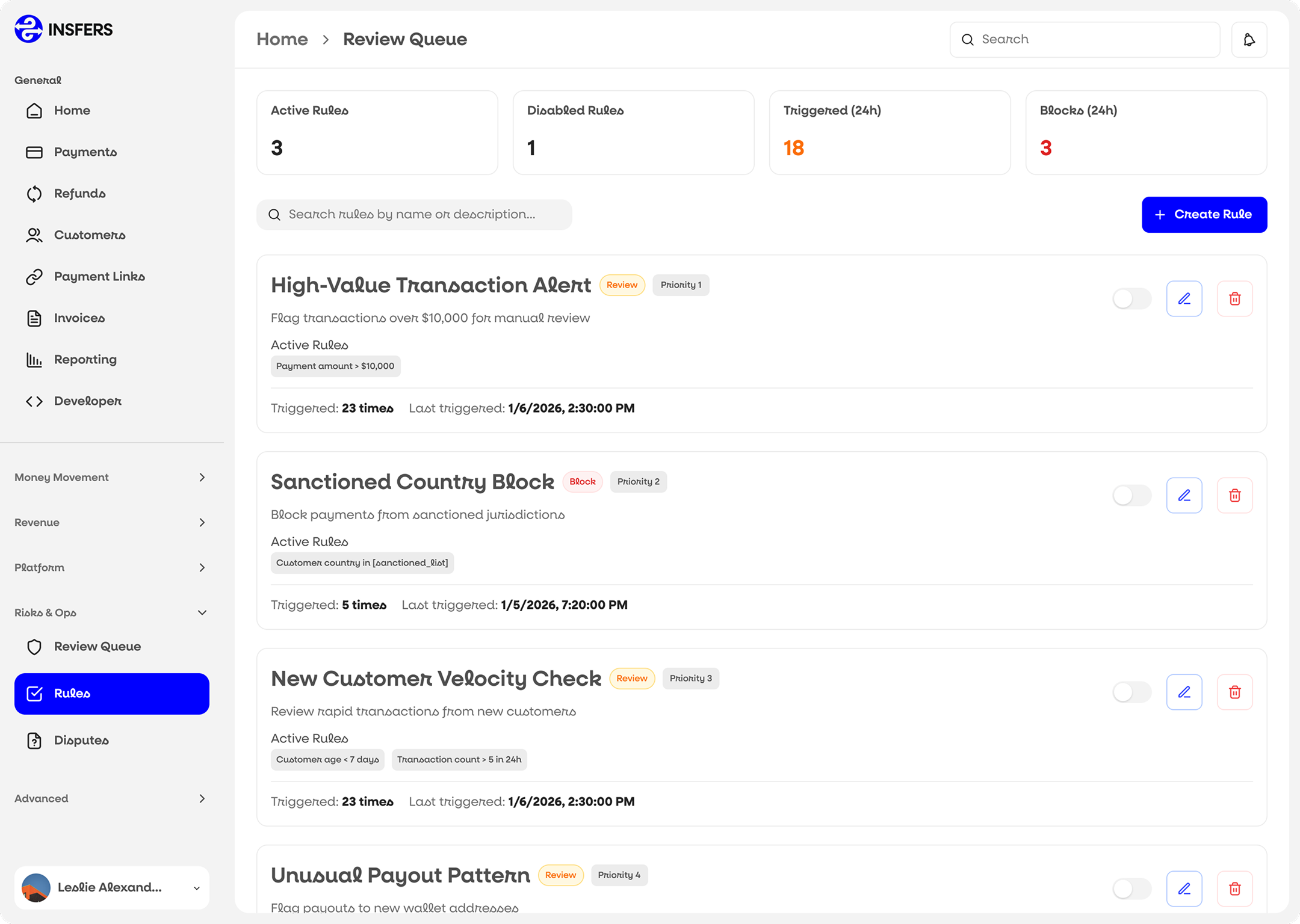
A restrained, confident visual system made a live firehose feel composed instead of chaotic. Color carries meaning, not decoration; motion signals change, not noise.
Every component earns its place. Charts appear only when they add clarity, color is reserved for meaning, and whitespace does the heavy lifting — so even a real-time firehose reads as calm and controlled.
Rolled out across the platform, the system holds up everywhere — from the decision-first home view to deep drill-downs. Here's how it shows up in context.
Insfers turned real-time data into decisions non-technical teams make every day, with sub-second answers and 99.9% uptime. Clarity at scale stopped being an analyst's job and became everyone's.